Responsive Web Design Services
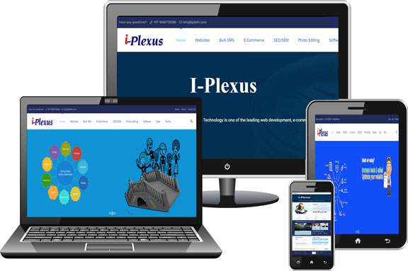
Internet usage on smartphones and tablets is growing by the day. There are, in a rough estimate, more than a billion of them out there. A lion's share of internet searches, thus, is now performed on handheld devices. Their screen sizes and resolutions differ greatly. This in turn necessitates that websites be developed in a manner that their content can be browsed with ease, regardless of the device and its screen size. An apparently difficult goal, it can be attained easily with skillful responsive web design.
Responsive web design or RWD is a fast evolving web designing trend which aims to develop websites optimized for devices with different resolutions and screen widths. This technology allows web designers to code the style sheets of a website in a way that it automatically customizes its layout, images, navigation and text to comfortably fit the users' hand held device to look just as it will on laptops and desktops.
RWD development eliminates the need to develop separate versions of a website for desktops and mobiles thereby saving time and money. This approach assures that your customers enjoy a seamless experience and have an ease of access to the same information virtually over multiple devices. It removes the headache of maintaining content on multiple sites and keeps your brand message and web presence consistent. Other advantages include :-
Web Design Services:
- Increased reach to mobile device audiences
- Increased visibility on search engines
- Reduced maintenance cost and time
- Increased sales and conversion rates
- Analysis of current website
- Implementation of responsive design
- Assessment of websites compatibility across browsers and devices
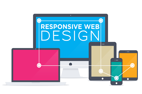
Responsive Web Design
Responsive web design i plexus is an approach to web design which makes web pages render well on a variety of devices and window or screen sizes. Recent work also considers the viewer proximity as part of the viewing This in turn necessitates that websites be developed in a manner that their content can be browsed with ease, regardless of the device and its screen size. An apparently difficult goal, it can be attained easily with skillful responsive web design. Responsive web design or RWD is a fast evolving web designing trend which aims to develop websites optimized for devices with different resolutions and screen widths. This technology allows web designers to code the style sheets of a website in a way that it automatically customizes its layout, images, navigation and text to comfortably fit the users' hand held device to look just as it will on laptops and desktops. RWD development eliminates the need to develop separate versions of a website for desktops and mobiles thereby saving time and money. This approach assures that your customers enjoy a seamless experience and have an ease of access to the same information virtually over multiple devices. Responsive Web design is the approach that suggests that design and development should respond to the user's behavior and environment based on screen size, platform and orientation. The practice consists of a mix of flexible grids and layouts, images and an intelligent use of CSS media queries It removes the headache of maintaining content on multiple sites and keeps your brand message and web presence consistent. Other advantages include